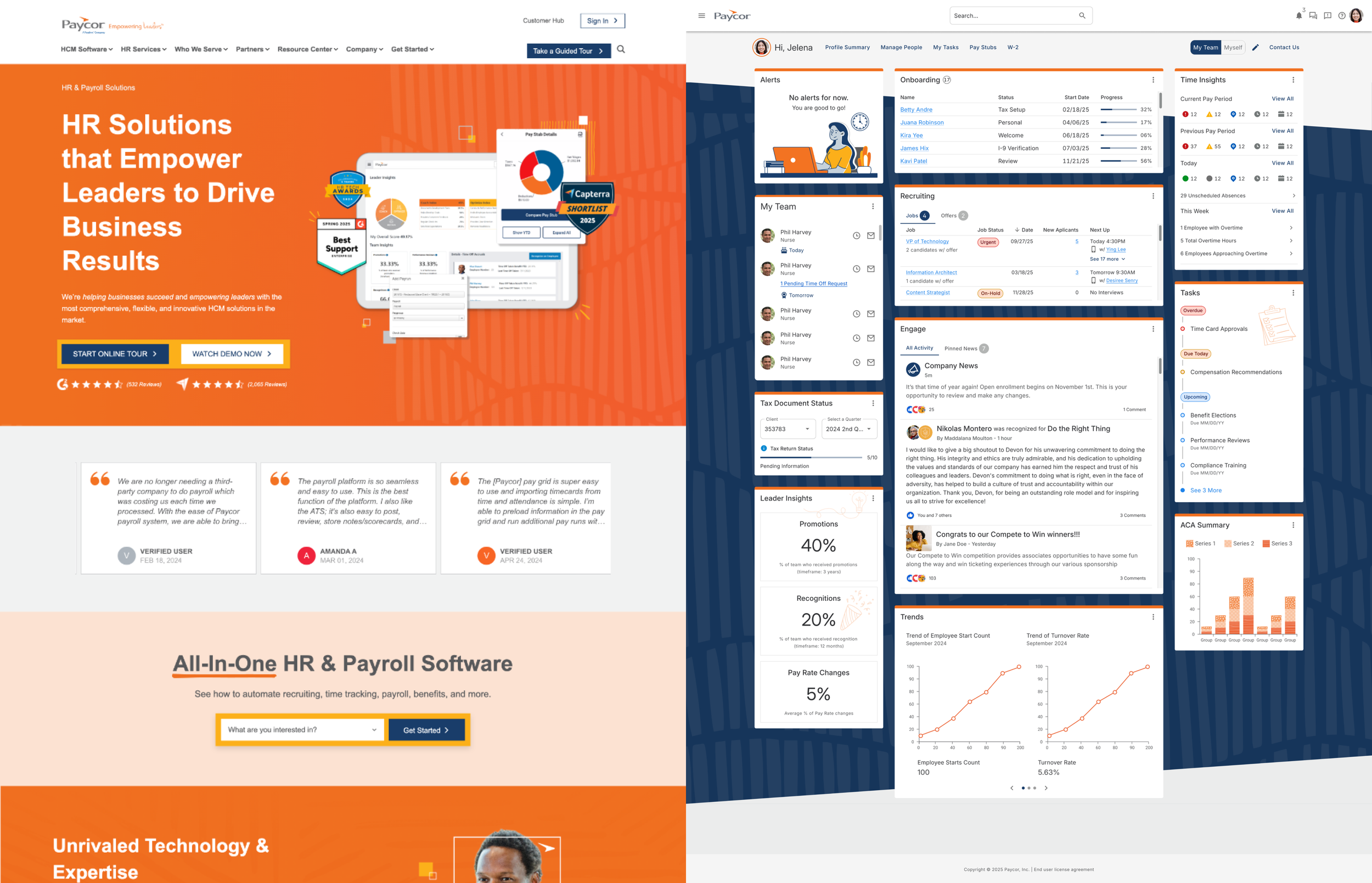
Dashboard Transformation
Turning Paycor’s #1 Sales Objection Into a Competitive Advantage
Role: Director of Product Design
Partners: Product Management, Engineering, Sales Leadership, Marketing
Impact: Turned UI/UX from a $776K quarterly liability to an $846K competitive advantage
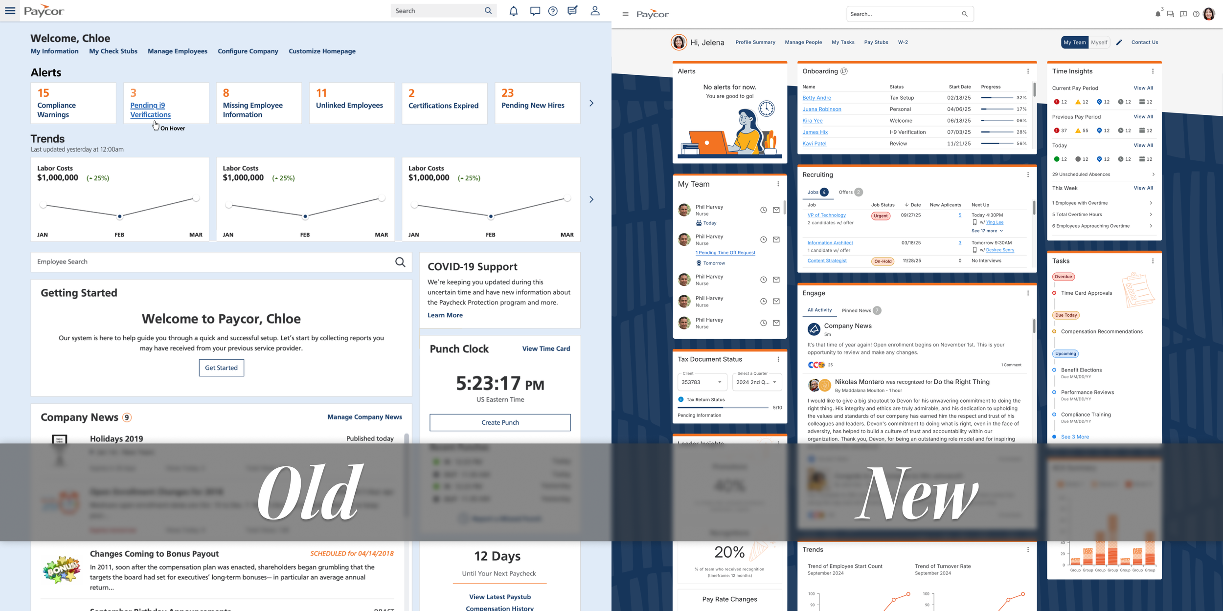
Figma comps of our dashboard, old and new.
Our dashboard was costing us deals. Not occasionally, but consistently. Quarter after quarter, we kept losing opportunities where prospects explicitly cited our UI or UX as a deciding factor.
The problem had been building for a while. By Q1 FY25, it reached a point where we were fed up with. We were losing 58% of deals where UI/UX came up as a concern. That translated to $776K in lost revenue in Q1 FY25 alone.
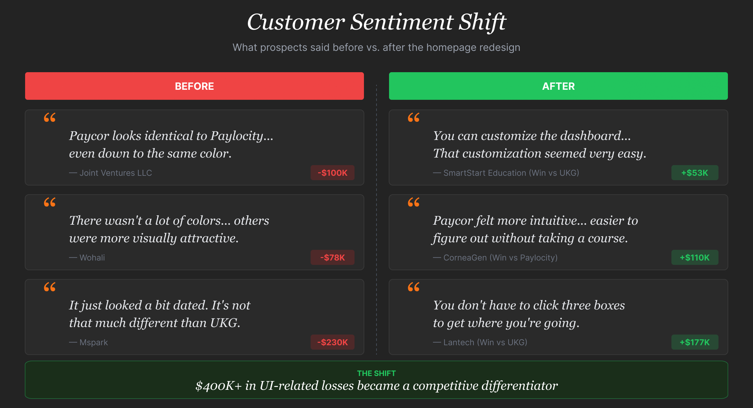
What prospects were saying:
“There wasn't a lot of colors. There weren’t a lot of features other than a line-by-line thing. Some of the others had different things that were more visually attractive.”
“[Paycor] wasn't as intuitive. The UI just looks clunky and dated.”
Let's be real, that last one stings. Our dashboard had become a liability. Users bypassed it entirely, heading straight to specific modules because the landing experience wasn't helping them get work done. We needed to turn this around, and fast.
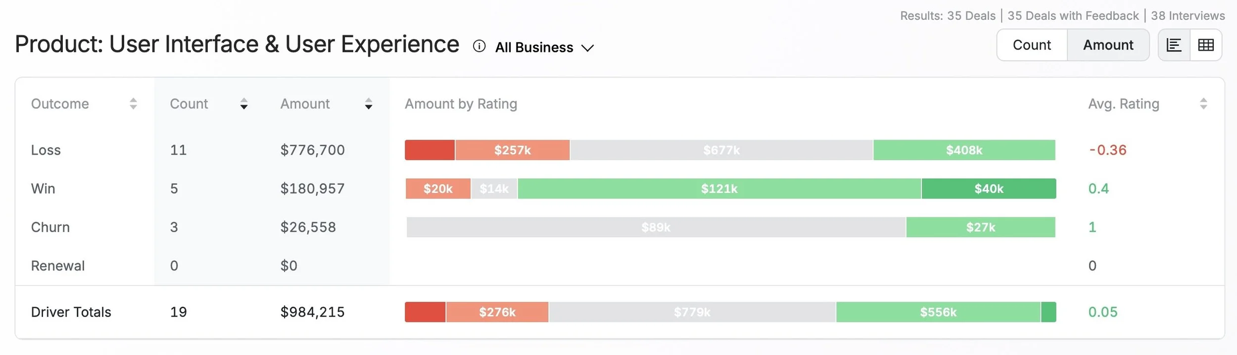
Win/Loss data for Q1 FY25
What Made This Hard
Sales needed wins, yesterday. Every quarter without a fix meant more lost deals. The pressure was real — senior leadership wanted fast results, but rushing a redesign without understanding the problem would make things worse.
Different people, different needs. Admins, managers, and employees all landed on the same generic dashboard with no clear path to their most important tasks. A one-size-fits-all approach was failing everyone.
We were losing to perception. Paylocity's modern UI made our product look dated, which signaled to prospects that our technology might be outdated too. We needed to change how people saw us — not just what they saw.
How We Approached It
We structured the work in three phases. Each phase built on what we learned in the previous one.
Phase 1: Stop and Understand the Real Problem
When sales pressure mounted to “just make it look modern,” I pushed back. My instinct told me we needed more than visual polish — we needed to understand why users found our UI “clunky” and what “excessive clicking” actually meant in their day-to-day work.
I partnered with Sales Leadership to analyze lost deals and identify patterns. The product design team conducted testing with current customers. We needed to see where they struggled and hear their frustrations in their own words.
The insight: People weren't asking for a prettier dashboard, they needed one that understood their role and helped them complete tasks faster.
Phase 2: Test Ideas Before Building Anything
Rather than jumping straight into the development of a full redesign, I pushed the team to validate our thinking early. The team created multiple design directions exploring different approaches: role-based content, visual differentiation, and task organization.
We brought Sales into concept testing sessions — not just users. If something tested well with users but didn’t help close deals, we hadn't solved the business problem. Both perspectives mattered.
We clearly saw a direction that emerged: users strongly preferred separating "My Team" from "Myself" tasks (92% preference), and they wanted customization without the complexity of traditional dashboard tools.
Phase 3: Build Cross-Functional Ownership
The biggest risk in strategic projects isn't the design — it's getting organizational buy-in. I brought key portfolio leaders into design thinking workshops and ran in-person working sessions to build shared ownership and improve team dynamics from the start. I kept senior leadership in the loop — regular updates, even when the news wasn't great.
That groundwork paid off during execution. When decisions needed to be made quickly, we didn't have to stop and re-align — everyone already understood the why behind the work.
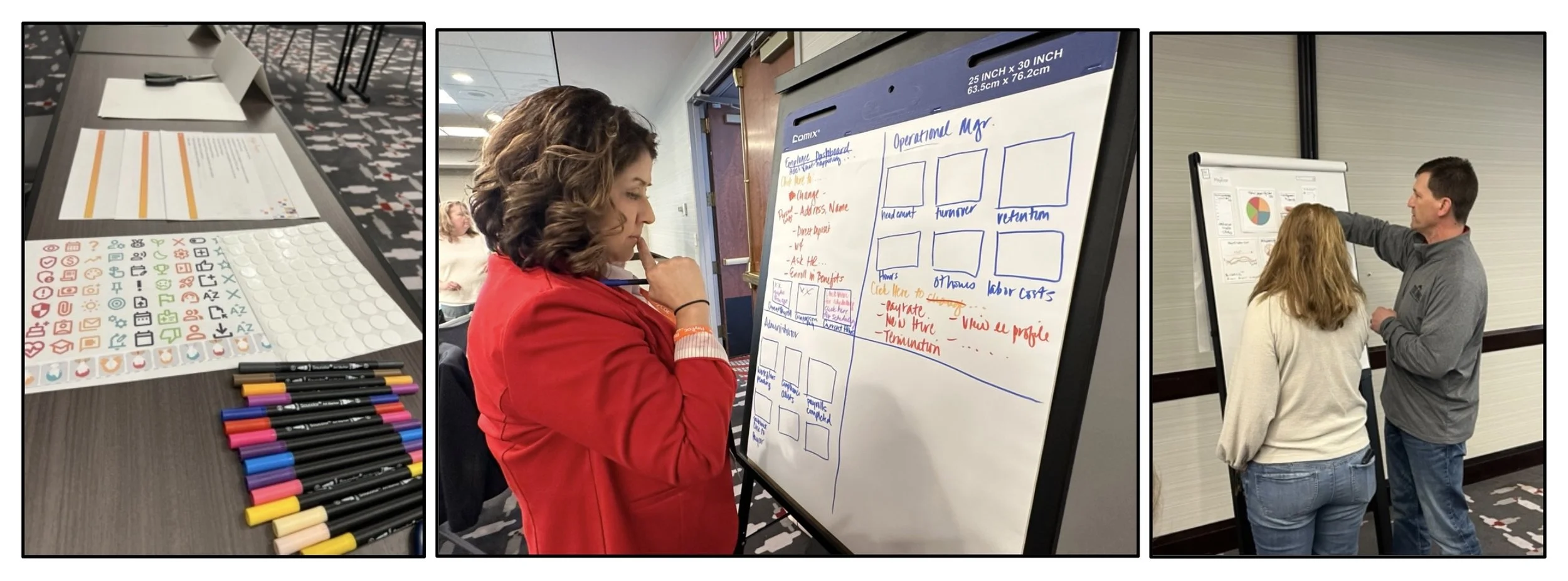
Photos from one of our design thinking workshops.
The Decisions That Mattered
Looking back, four decisions shaped this project’s success:
1. We Led with Research, Not Redesign
When Sr. Leadership and sales pressure mounted to “just make it look modern,” I held the line. Testing revealed that a visual refresh alone wouldn't solve the core problem. Users needed task-based organization and role separation — insights we'd have completely missed if we'd rushed into a redesign.
2. We Structured Around Roles, Not Just Looks
The organizational change delivered more value than any visual update could have alone. The team designed the new dashboard around how people actually work — separating manager tasks (“My Team”) from individual tasks (“Myself”).
92% of users preferred this separation in testing because it cut through the noise and got them to the work they needed to do faster.
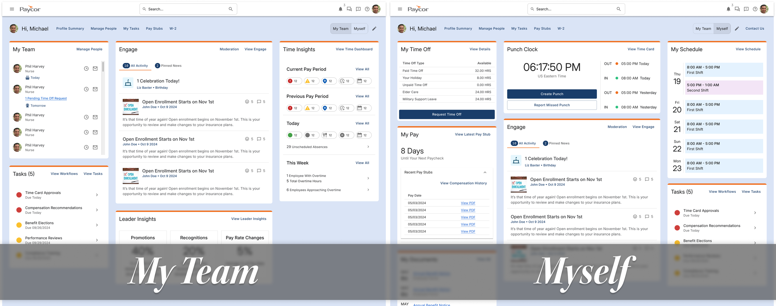
Wireframes of “My Team” view and “Myself” view.
3. We Made Customization Simple
Users wanted control over their workspace, but traditional customization tools add overwhelming complexity. The team designed a system where admins could set company-wide defaults while individuals could move widgets without navigating complex settings. 83% of users were excited about this approach because it gave them flexibility without the cognitive overhead.
4. We Created Strategic Visual Differentiation
Our high-contrast navy theme wasn't just about aesthetics — it was positioning and alignment. We needed to set ourselves apart from Paylocity's lighter interface so prospects could see immediately that we were different.
But just as important, we needed to align more closely with our marketing team. The navy theme helped us close the gap in our full customer experience — from the zero moment of truth (when prospects first discover us) all the way through the sales funnel to the second moment of truth (when they actually use the product).
This visual differentiation signaled modern technology and intentional design, which helped change the conversation from “your UI looks dated” to “your interface feels more polished.”
Comparison of marketing site vs. dashboard
What Changed
We launched the revamped dashboard near the end of Q2 FY25. The turnaround was immediate.
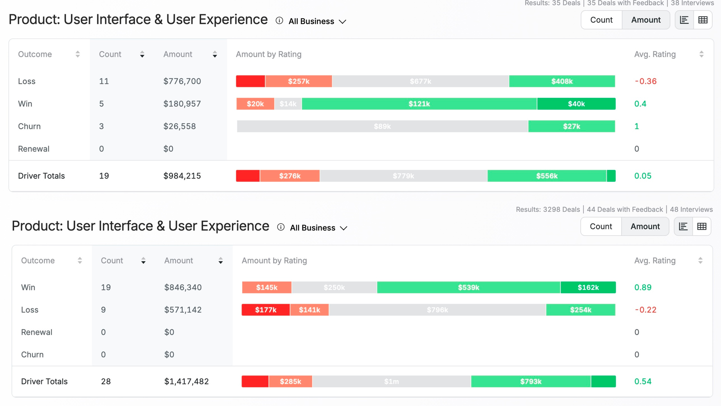
Win/Loss data comparison for Q1 FY25 and Q3 FY25 (post dashboard launch)
The Turnaround
|
Q1 FY25 (Before)
|
Q3 FY25 (After Launch)
|
The Impact
UI/UX went from a liability costing us deals to a competitive advantage helping us win. Within the same fiscal year, we reversed the perception entirely — from prospects citing our interface as a reason to walk away to citing it as a reason to choose us.
The average UI/UX driver rating shifted from +0.05 to +0.54 — moving from neutral perception to a meaningful competitive advantage.
What Prospects Started Saying
“Overall, [Paycor] has a very clean look and feel. It seems like a newer UI… a more modern architecture in the software. It just looks cleaner and more flexible. That's what I'm looking for.”
“[Paycor] was more intuitive… Everything was easier to use. Things just made more sense.”
The comments shifted from complaints about dated interfaces to praise for modern, intuitive design. That change in perception translated directly to revenue.
What I Learned
Invest in understanding early, move faster later. The upfront work in research and early testing prevented expensive rebuilds and political battles. When you can show executives data that supports your design decisions, you spend less time defending choices and more time shipping. If I did this again, I'd push for dedicated research resources from day one — working around availability constraints slowed our learning cycles.
Relationships over process documents. Running workshops and bringing senior leadership and sales into the design process created buy-in that no deck could have achieved. When people feel ownership of a solution, they push work forward instead of slowing it down with questions and concerns. Those working sessions weren't just about alignment — they were about building relationships that made every decision after that easier.
Transparency keeps projects on track. Regular updates to senior leadership and other stakeholders — including problems when they happened — kept this project green and prevented sudden pivots. No surprises meant no panic. When stakes are high, you can't delegate everything. I stayed close to the work and made key decisions because the team needed direction, not just support.
Project Details
|
My Contributions
|
Team Credits
|